6 Budget Friendly Ideas to Add Character to a Builder Grade House
I love a home that feels like it has a story to tell. A home that's filled with charm and character at every corner. But with a builder grade house, that's a little hard to accomplish. It's taken me a while to get my house to its current state. I've tried a few different styles, a lot of different paint colors, and a bunch of area rugs!
If you are looking for ways to add character to a builder grade house, then you've come to the right place!
Six years ago, we moved into our first house, a 2000+ square foot builder grade house that's the same floorplan as with the next three houses next to ours, yikes! Ever since moving in, I've been working on giving my home that character that I love in older homes. So, I've rounded up some of my favorite ways that I've updated my home on a budget.
*This post contains affiliate links, please read my full disclosure here. Thank you for supporting my blog.*
Paint
Paint is one of the easiest and most affordable way to make your mark on your home. Don’t think about just painting walls, you can practically use paint anywhere now, doors, cabinets, furniture, even floors! In my home, I've painted my walls, kitchen cabinets, bathroom vanity, furniture, and décor items. If it has a paintable surface, you better believe I will try to customize it to my style with paint.
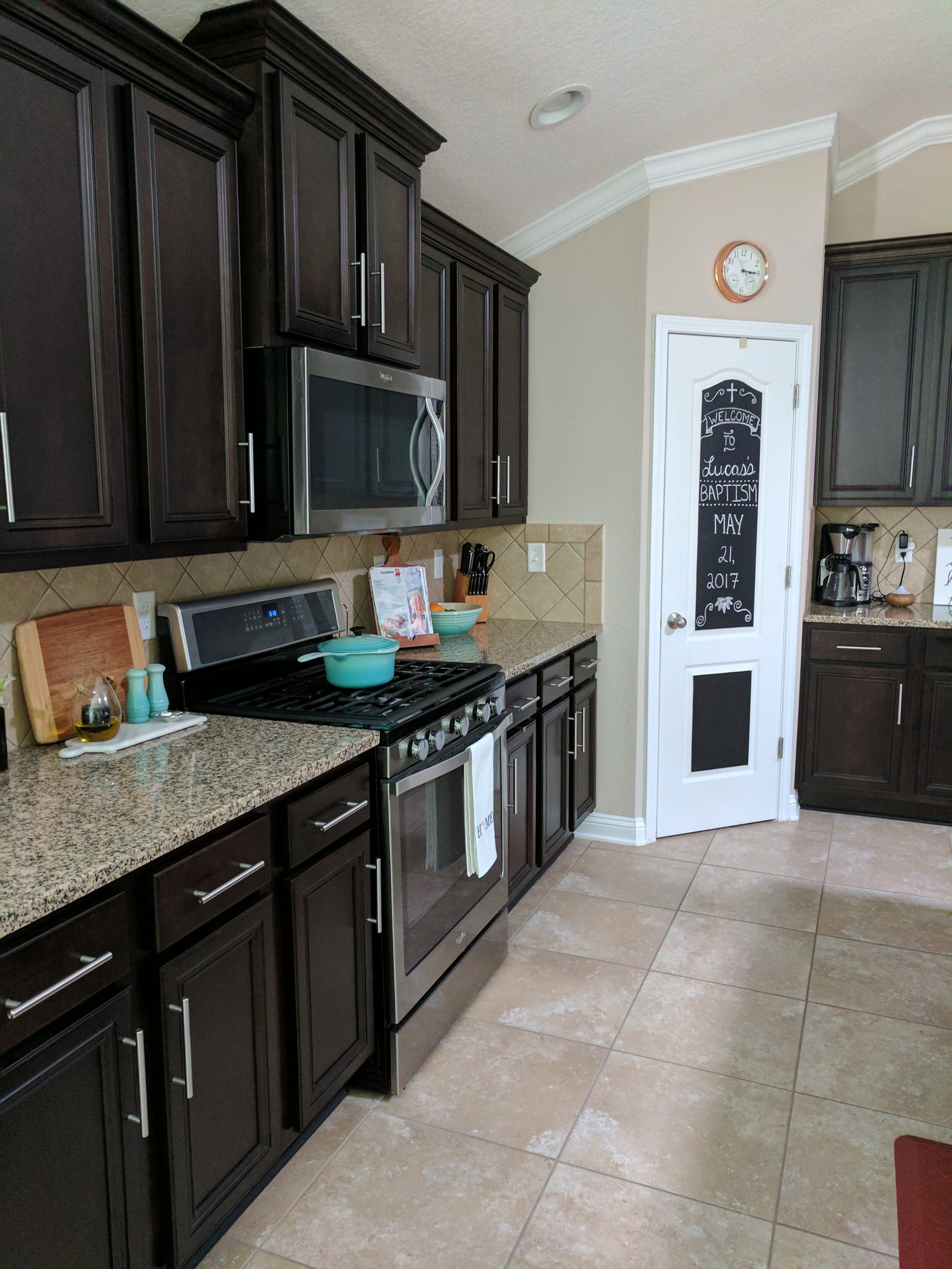
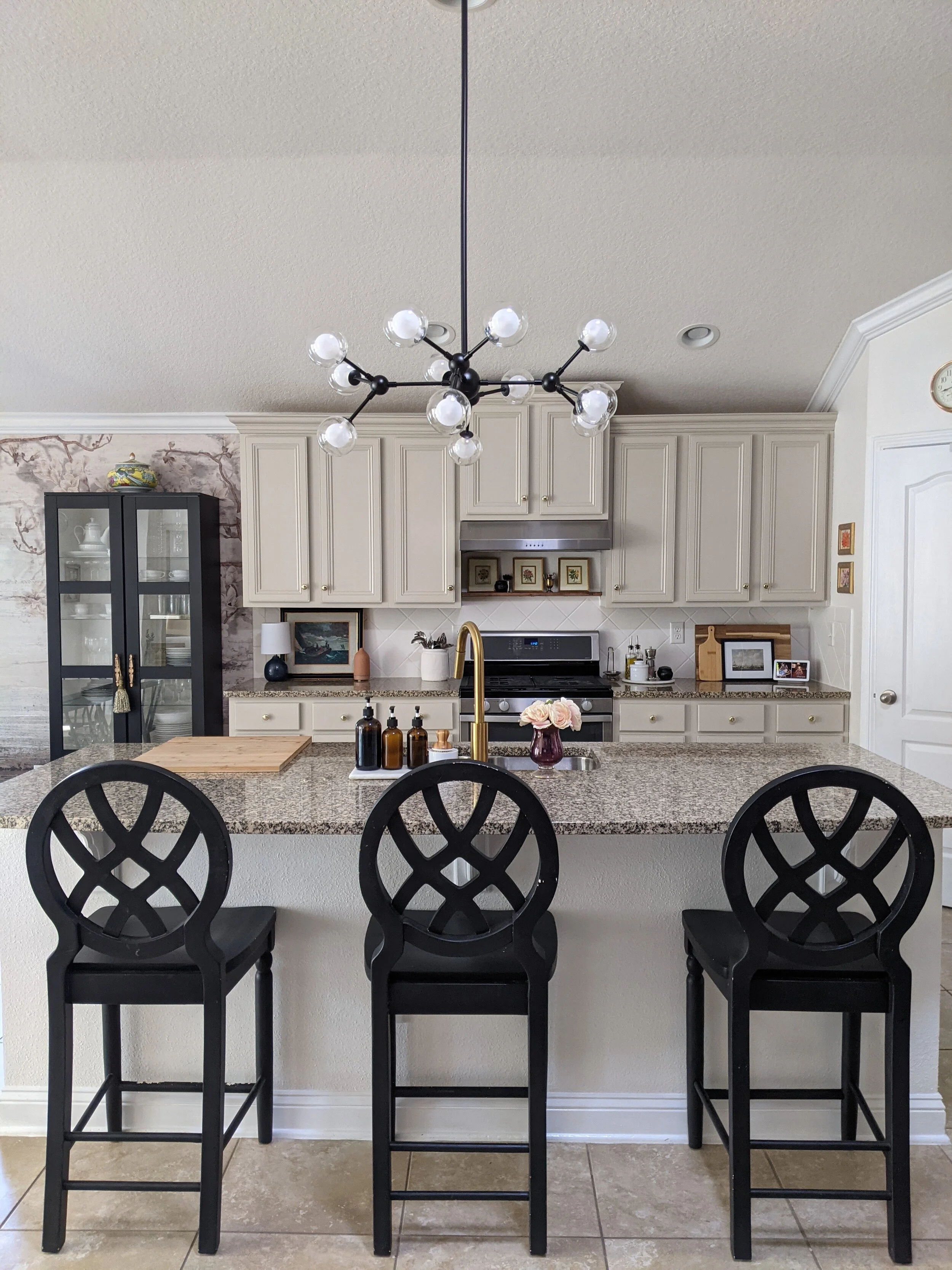
One of the best updates we’ve made to our home was painting our kitchen cabinets. It completely updated the space and saved us a TON of money. I also changed out the hardware and lighting to create a more modern look.
Kitchen BEFORE
Kitchen AFTER
You may also like:
Check out this post if you want to learn all about our affordable kitchen renovation.
I even painted the counter stools for this kitchen makeover, check out all the details here.
Light Fixtures
It's no wonder why they call lighting the jewelry of a house. Updating the lighting in your space will automatically help your home feel more like yours. When we moved into our home, it was covered in boob lights and dated chandeliers. As I've tackled each room, I've updated the lighting in each space to help the design fit in with the modern traditional style I’m after. You don't have to spend a lot of money either, check out some of my lighting roundups with a few of my favorite affordable lights:
Dining Room BEFORE
Dining Room AFTER
Entryway and Hallway Lighting
Window Treatments
When we first moved into our home, we had cheap faux wood blinds with cheap build quality that soon stopped operating properly. I thought we would have to spend thousands in getting quality replacements but after doing some research, I landed on these cordless whitewash bamboo blinds from Walmart! Not only are they super affordable and easy to install, but they are also beautiful! I can't recommend these blinds enough. We've had them for years now and still love them to this day. It's amazing how our home felt instantly updated and more current than with the old wood blinds.
I also love to layer in curtains to create a more traditional look. By hanging the curtains up high, closer to ceiling creates the illusion of super high ceilings which I love!
Bedroom BEFORE
Bedroom AFTER
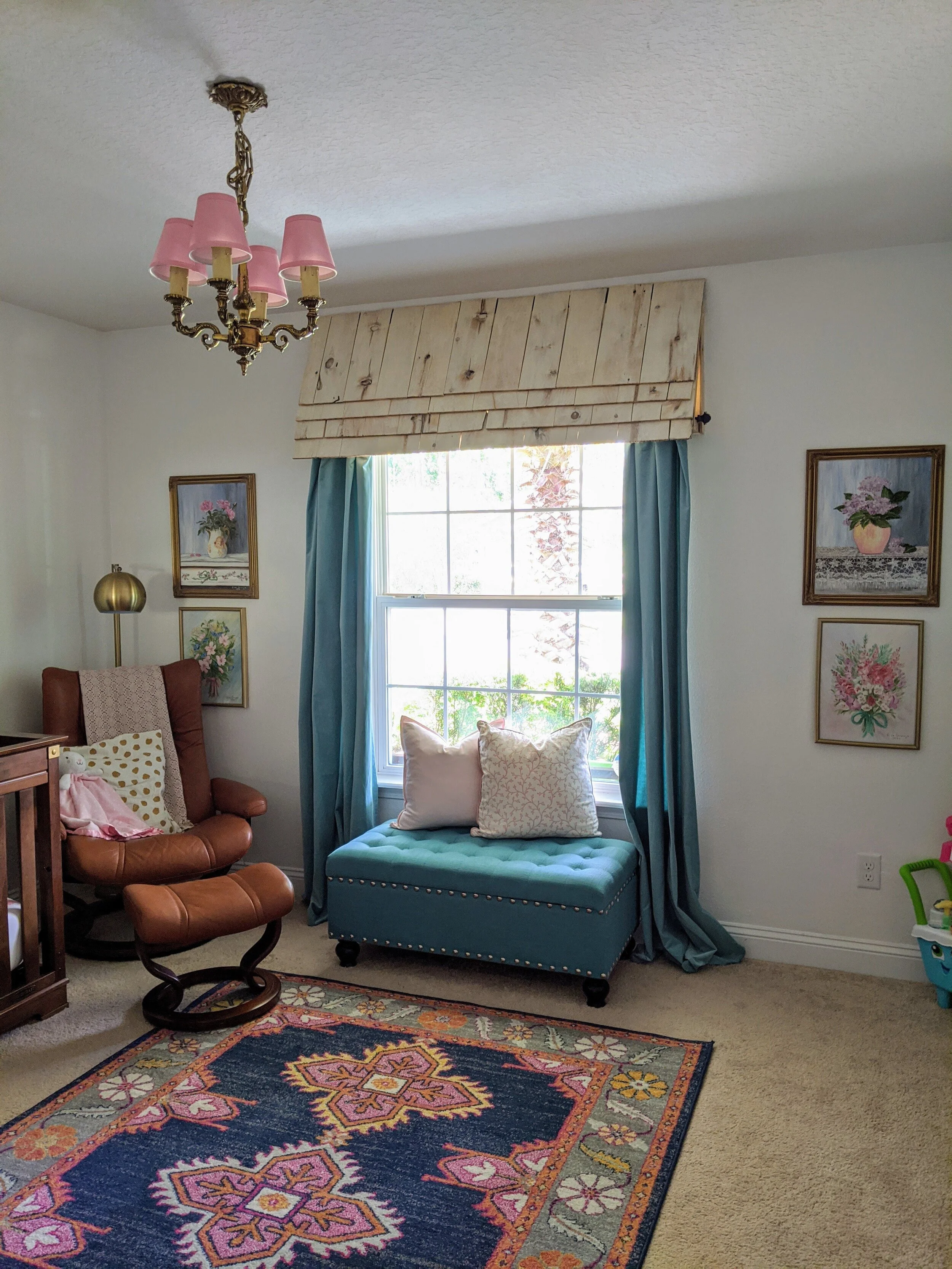
Don't be afraid to think outside the box with window treatments too. In my daughter's room, I built this awning to give her room a little more interest.
Wallpaper
Earlier this year, we invested in a wall mural for our dining room and I can't believe the difference in our home. It is absolutely beautiful and you can find me staring at this wallpaper several times a day! Wallpaper can get expensive, which is why I chose to use a mural and focus on one wall.
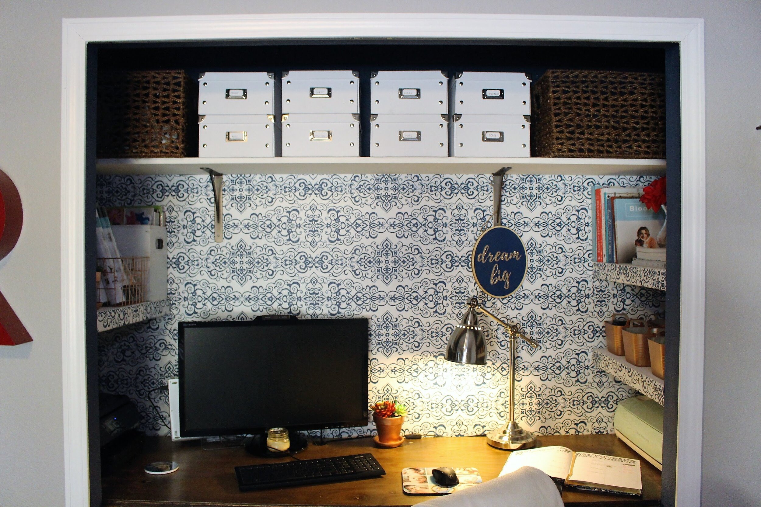
Think of fun, small spaces in your home to add a little bit of color. I used a peel and stick wallpaper in my closet office and loved the look!
Dining Room Wallpaper Mural
Area Rugs
Our house is open concept which can sometimes be hard to create different "rooms" within the space. I like to use area rugs to separate each space and help create separation for each room. It’s a super easy way to bring in some color and cover up flooring that you may not be too crazy about.
I also like to layer rugs over our area rugs in the bedroom to bring in some more color and character to each space.
Landscape
On the exterior of our home, one of the easiest ways to make it stand out was to update the landscaping. Builders tend to use the same plants throughout the neighborhood, making the houses look uniform. We wanted to give our home a different look, so we invested in a landscape architect to come out and give us some ideas. We saved money by keeping the shape of the flower bed the same, but invested in flowering plants and a palm tree to give our home an updated look.
I hope this post helps inspire you to make your house YOURS!
I’m a mom of two and wife to a seriously supportive hubby, living our best life in our forever house by the preserve! I'm all about helping you create a stylish, Pinterest-worthy home on a budget. Let's obsess over interior design, home decor, DIY, and home improvement projects to help you create your best home. Follow along and say hello! I love hearing from you.
Join me on Instagram!
Looking for something?
Currently Trending

